How to Build Universal Lens Protocol Social Apps With React Native
In this article we will focus on building a universal (web, iOS, Android) web3 social network app on Lens Protocol with React Native. If you need a standard web3 cross-platform setup, see this guide for more in-depth explanation:
Special thanks to Nader Dabit and Vivek Suthar for reviewing the final repository regarding Lens Protocol best practices.
What is Lens Protocol?
Lens Protocol is the building blocks for building web3 social applications. It is a web3 social graph on the Polygon blockchain, and it seeks to solve major problems with existing social networks, which all have their centralized databases and fight for your attention and content.
In Lens, users own their data. Since users’ profiles, publications, and reactions live in the protocol, they can read and write content to any application built on top of the protocol, and it will be available everywhere. Each application built on Lens benefits the whole ecosystem, and developers can design meaningful social experiences without the need to turn to feedback mechanisms to lock in the user's attention.
For example, Orb is a client focused on the mobile experience, communities and creators. Buttrfly is an explorer for both web and mobile. And Tape is a platform focused on video content. While all of them share your data on the Lens Protocol, each have their own set of features and tailored experience.
This is how my profile looks on each of them. They share the data but optimize the UX according to each app's focus.

Building a universal social app
We’ll start off from a web3 cross-platform setup similar to what we've built previously in the article mentioned above. This will save us time from setting up custom navigation for each platform (sidebar on web, tabs on mobile) and setting up Web3Modal on both platforms to connect the wallet.
If you want to check the final result directly, see the final code.
To follow along with this article, download the final code and switch to the article-start branch, which is a clean state branch without the social app features we will build in the following sections.
git checkout article-start
Our setup uses Expo to create a cross-platform app, WalletConnect Web3Modal to connect the wallet and Wagmi for useful Ethereum hooks. You may want to read the article on how to set up cross-platform web3 apps first to understand the reasoning behind this setup.
In the end, you’ll have a universal social app with a simple feed and profile page, running on native and web.

Installing the Lens SDK
Let's start by installing the Lens Protocol SDK. The SDK reference is here, and you can read more about all Lens concepts in the docs.
| # Install the Lens web SDK | |
| yarn add @lens-protocol/react-web@alpha | |
| # Install the Lens React Native SDK | |
| yarn add @lens-protocol/react-native@latest | |
| # Install the Wagmi companion package | |
| yarn add @lens-protocol/wagmi@alpha |
Notice that you don't need to install ethers@legacy-v5 as suggested in the SDK reference because we will be using Viem instead.
Also install Expo SecureStore - a safe alternative to AsyncStorage - so we can safely store our SDK access tokens.
| npx expo install expo-secure-store |
With the packages installed, we're ready to create a cross-platform module. Similar to src/lib/web3modal, we’ll create a src/lib/lens-sdk module and use Platform-specific file extensions so the Metro bundler can import either the web or native SDK conditionally based on the platform the code is running on.
In src/lib/lens-sdk/index.ts add the code that is going to run on native:
| import { LensConfig, development } from '@lens-protocol/react-native'; // <-- Import the react-native package | |
| import { bindings as wagmiBindings } from '@lens-protocol/wagmi'; | |
| import * as SecureStore from 'expo-secure-store'; | |
| const lensConfig: LensConfig = { | |
| bindings: wagmiBindings(), | |
| // Use `development` or `production` depending on your need | |
| environment: development, | |
| storage: { | |
| getItem: SecureStore.getItemAsync, | |
| setItem: SecureStore.setItemAsync, | |
| removeItem: SecureStore.deleteItemAsync, | |
| }, | |
| }; | |
| // Re-export everything from the Lens native SDK, as well as the config | |
| export * from '@lens-protocol/react-native'; | |
| export { lensConfig }; |
In src/lib/lens-sdk/index.web.ts add the code that is going to run on web:
| import { LensConfig, development } from '@lens-protocol/react-web'; // <-- Import the web package | |
| import { bindings as wagmiBindings } from '@lens-protocol/wagmi'; | |
| const lensConfig: LensConfig = { | |
| bindings: wagmiBindings(), | |
| // Use `development` or `production` depending on your need | |
| environment: development, | |
| }; | |
| // Re-export everything from the Lens web SDK, as well as the config | |
| export * from '@lens-protocol/react-web'; | |
| export { lensConfig }; |
Notice that both are very similar, with the major difference being that we change the SDK that we are importing on the first line, and on native we are using SecureStore as the storage mechanism.
Since these index files are going to be imported conditionally depending on the platform, we need to export the exact same variables otherwise the application might crash during runtime if it’s trying to access something that doesn't exist.
To finalize the Lens SDK setup, we just need to add the LensProvider to our App.tsx.
| ... | |
| import { lensConfig, LensProvider } from './src/lib/lens-sdk'; | |
| export default function App() { | |
| return ( | |
| <WagmiConfig config={wagmiConfig}> | |
| {/* Add the provider with the config */} | |
| <LensProvider config={lensConfig}> | |
| <StatusBar style="auto" /> | |
| <Web3Modal /> | |
| <SafeAreaProvider> | |
| <NavigationContainer theme={reactNavigationTheme}> | |
| <RootNavigator /> | |
| </NavigationContainer> | |
| </SafeAreaProvider> | |
| </LensProvider> | |
| </WagmiConfig> | |
| ); | |
| } |
Remember to import everything related to Lens from our recently-created lens-sdk module, so imports are resolved correctly depending on the platform.
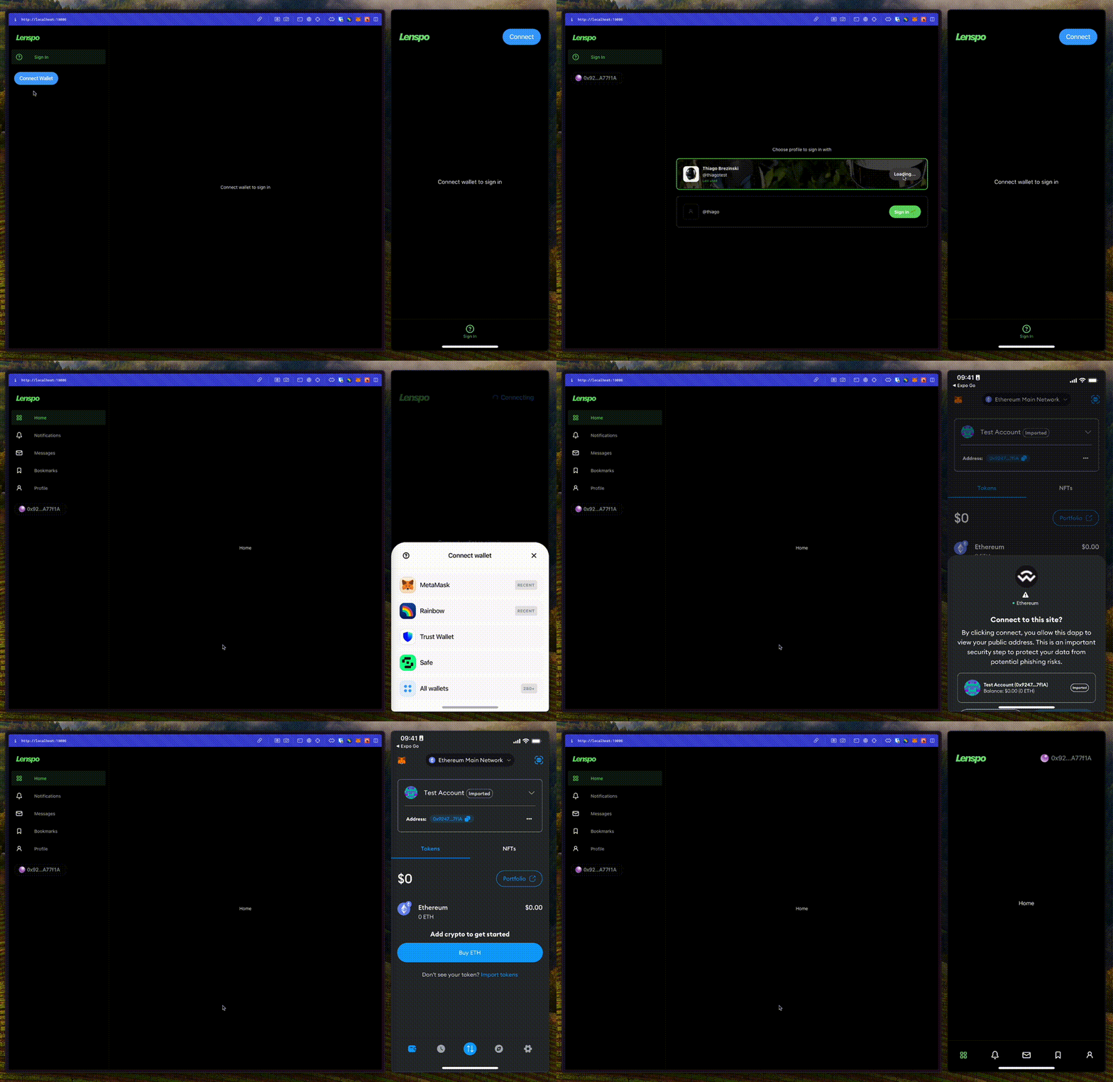
Easy enough, if you run the app at this point, you should see a blank template. We are going to add the new screens in the next section.
| # iOS | |
| npm run ios | |
| # Android | |
| npm run android | |
| # Web | |
| npm run web |
-1-1792w.webp)
Sign-in flow
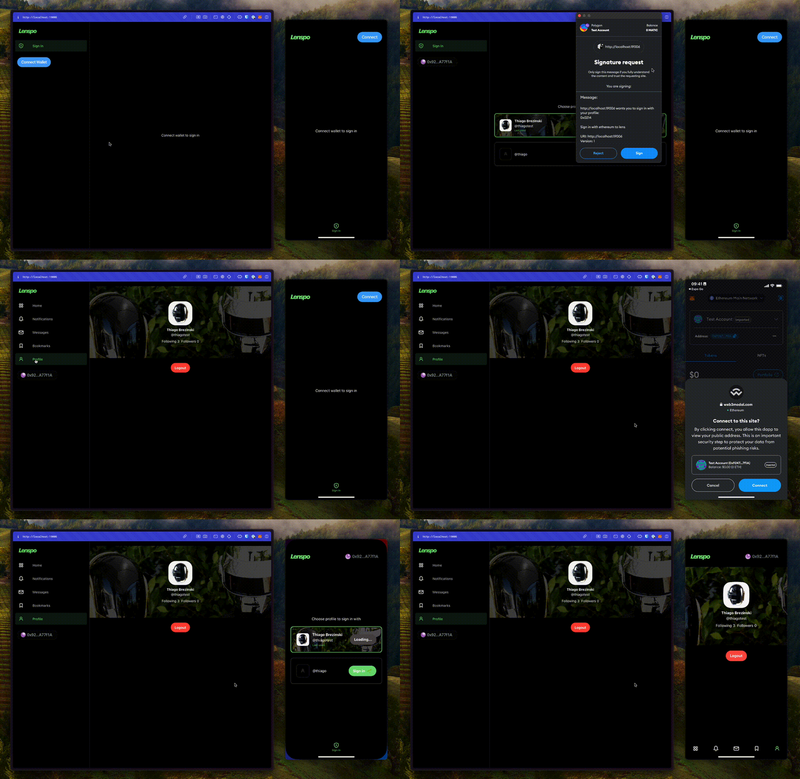
Now that we have the Lens SDK ready to use, let's build the sign-in flow.
Each wallet can manage multiple Lens profiles, dictated by the presence of Lens profile NFTs or by delegating the permissions to another wallet. So we need to connect the wallet, query the available profiles, and display an interface for the user to choose which one to log in with.
First, in src/lib/navigation/RootNavigator.tsx, let's block our routes. If the user is authenticated, render all the routes normally, otherwise render the SignInScreen.
| ... | |
| import SignInScreen from '../features/sign-in/SignInScreen'; | |
| import { SessionType, useSession } from '../lens-sdk'; | |
| const screens = [ | |
| ... | |
| ] as const; | |
| const RootNavigator = () => { | |
| const { data: session } = useSession(); // Get the session | |
| // Check if user is authenticated | |
| const authenticated = | |
| session?.authenticated && session?.type === SessionType.WithProfile; | |
| if (Platform.OS === 'web') { | |
| return ( | |
| <RootDrawer.Navigator | |
| drawerContent={DrawerContent} | |
| screenOptions={{ | |
| header: () => null, | |
| drawerType: 'permanent', | |
| }}> | |
| {/* If authenticated, render all the routes normally, otherwise, render only the SignIn route */} | |
| {authenticated ? ( | |
| screens.map(screen => ( | |
| <RootDrawer.Screen | |
| key={screen.name} | |
| name={screen.name} | |
| component={screen.component} | |
| options={{ | |
| drawerIcon: ({ focused }) => ( | |
| <NavIcon screenName={screen.name} focused={focused} /> | |
| ), | |
| }} | |
| /> | |
| )) | |
| ) : ( | |
| <RootDrawer.Screen | |
| name="SignIn" | |
| component={SignInScreen} | |
| options={{ | |
| title: 'Sign In', | |
| drawerIcon: ({ focused }) => ( | |
| <NavIcon screenName="SignIn" focused={focused} /> | |
| ), | |
| }} | |
| /> | |
| )} | |
| </RootDrawer.Navigator> | |
| ); | |
| } | |
| return ( | |
| <RootTab.Navigator | |
| screenOptions={{ | |
| header: () => <TabHeader />, | |
| }}> | |
| {/* If authenticated, render all the routes normally, otherwise, render only the SignIn route */} | |
| {authenticated ? ( | |
| screens.map(screen => ( | |
| <RootTab.Screen | |
| key={screen.name} | |
| name={screen.name} | |
| component={screen.component} | |
| options={{ | |
| tabBarLabel: () => null, | |
| tabBarIcon: ({ focused }) => ( | |
| <NavIcon screenName={screen.name} focused={focused} /> | |
| ), | |
| }} | |
| /> | |
| )) | |
| ) : ( | |
| <RootTab.Screen | |
| name="SignIn" | |
| component={SignInScreen} | |
| options={{ | |
| title: 'Sign In', | |
| tabBarIcon: ({ focused }) => ( | |
| <NavIcon screenName="SignIn" focused={focused} /> | |
| ), | |
| }} | |
| /> | |
| )} | |
| </RootTab.Navigator> | |
| ); | |
| }; | |
| export default RootNavigator; |
To make TypeScript happy, we need to go back to src/lib/navigation/index.ts and add a SignIn key to the ParamList type, so our router knows that it is a possible route.
| import { createBottomTabNavigator } from '@react-navigation/bottom-tabs'; | |
| import { createDrawerNavigator } from '@react-navigation/drawer'; | |
| export type ParamList = { | |
| SignIn: undefined; // Add the SignIn route | |
| Home: undefined; | |
| Notifications: undefined; | |
| Messages: undefined; | |
| Bookmarks: undefined; | |
| Profile: undefined; | |
| }; | |
| export const RootTab = createBottomTabNavigator<ParamList>(); | |
| export const RootDrawer = createDrawerNavigator<ParamList>(); |
And finally, let's build the actual SignInScreen in src/features/sign-in/SignInScreen.tsx.
| import React from 'react'; | |
| import { StyleSheet, View } from 'react-native'; | |
| import { useAccount } from 'wagmi'; | |
| import Text from '../../components/Text'; | |
| import { useLastLoggedInProfile, useProfilesManaged } from '../../lib/lens-sdk'; | |
| import ProfileCard from './ProfileCard'; // This component does not exist yet, we'll create it next | |
| export default function SignInScreen() { | |
| // Get the connected wallet address | |
| const { isConnected, address } = useAccount(); | |
| // Query the profiles managed by the connected wallet address | |
| const { data: profiles = [] } = useProfilesManaged({ | |
| for: address, | |
| }); | |
| // Query the last logged in profile for the connected wallet address | |
| const { data: lastLoggedInProfile } = useLastLoggedInProfile({ | |
| for: address, | |
| }); | |
| // Sort the profiles so that the last logged in profile is at the top | |
| const sortedProfiles = [...profiles].sort((a, b) => { | |
| if (a.id === lastLoggedInProfile?.id) { | |
| return -1; | |
| } | |
| if (b.id === lastLoggedInProfile?.id) { | |
| return 1; | |
| } | |
| return 0; | |
| }); | |
| return ( | |
| <View style={styles.container}> | |
| {isConnected ? ( | |
| <> | |
| <Text>Choose profile to sign in with</Text> | |
| {/* Render a profile card for each profile */} | |
| {sortedProfiles.map(profile => ( | |
| <ProfileCard | |
| key={profile.id} | |
| profile={profile} | |
| isLastLoggedInProfile={profile.id === lastLoggedInProfile?.id} | |
| /> | |
| ))} | |
| </> | |
| ) : ( | |
| <Text>Connect wallet to sign in</Text> | |
| )} | |
| </View> | |
| ); | |
| } | |
| const styles = StyleSheet.create({ | |
| container: { | |
| flex: 1, | |
| alignItems: 'center', | |
| justifyContent: 'center', | |
| marginHorizontal: 20, | |
| gap: 20, | |
| }, | |
| }); |
Here's the breakdown of what is happening in this screen:
- Using the Wagmi hook useAccount(), we get the connected wallet address
- Using the Lens SDK hook useProfilesManaged(), we get all the profiles managed by that wallet address
- Using the Lens SDK hook useLastLoggedInProfile(), as the name suggests, we get the last profile used to sign in by that wallet address
- Then, to achieve a better UX, we sort the profiles to put the last one used on top of the list
- And finally, we render a ProfileCard for each profile, displaying the name, handle, and a button to sign in.
Next we need to create the missing ProfileCard component. In src/features/sign-in/ProfileCard.tsx, add this:
| import React from 'react'; | |
| import { ImageBackground, StyleSheet, View } from 'react-native'; | |
| import { Image } from 'expo-image'; | |
| import Octicons from '@expo/vector-icons/Octicons'; | |
| import Text from '../../components/Text'; | |
| import { Profile, ProfilePictureSet } from '../../lib/lens-sdk'; | |
| import { LensButton } from '../../components/LensButton'; // This component does not exist yet, we'll create it next | |
| import { theme } from '../../lib/theme'; | |
| type ProfileCardProps = { | |
| profile: Profile; | |
| isLastLoggedInProfile: boolean; | |
| }; | |
| function ProfileCard({ profile, isLastLoggedInProfile }: ProfileCardProps) { | |
| const coverImageUri = profile.metadata?.coverPicture?.optimized?.uri; | |
| const avatarImageUri = (profile.metadata?.picture as ProfilePictureSet) | |
| ?.thumbnail?.uri; | |
| return ( | |
| // Display the cover image as the background of the card | |
| <ImageBackground | |
| style={[ | |
| styles.container, | |
| { | |
| borderColor: isLastLoggedInProfile | |
| ? theme.colors.primary | |
| : theme.colors.border, | |
| }, | |
| ]} | |
| source={{ | |
| uri: coverImageUri, | |
| }}> | |
| <View style={styles.overlay} /> | |
| <View style={styles.innerContainer}> | |
| <View style={styles.profileContainer}> | |
| {/* Display the profile avatar */} | |
| {avatarImageUri ? ( | |
| <Image | |
| accessibilityIgnoresInvertColors | |
| source={{ uri: avatarImageUri }} | |
| style={styles.avatarImage} | |
| /> | |
| ) : ( | |
| <View style={styles.avatarImage}> | |
| <Octicons name="person" size={16} color={theme.colors.disabled} /> | |
| </View> | |
| )} | |
| <View style={styles.textContainer}> | |
| {/* Display the profile name */} | |
| {profile.metadata?.displayName && ( | |
| <Text style={styles.name} numberOfLines={1}> | |
| {profile.metadata.displayName} | |
| </Text> | |
| )} | |
| {/* Display the profile handle */} | |
| {profile.handle?.localName && ( | |
| <Text numberOfLines={1}>@{profile.handle?.localName}</Text> | |
| )} | |
| {/* Display the last used profile indicator */} | |
| {isLastLoggedInProfile && ( | |
| <Text style={styles.lastUsedProfile}>Last used</Text> | |
| )} | |
| </View> | |
| </View> | |
| {/* Display the button to sign in */} | |
| <LensButton profileId={profile.id} /> | |
| </View> | |
| </ImageBackground> | |
| ); | |
| } | |
| const styles = StyleSheet.create({ | |
| container: { | |
| maxWidth: 800, | |
| width: '100%', | |
| height: 100, | |
| borderWidth: 2, | |
| borderRadius: 10, | |
| borderCurve: 'continuous', | |
| overflow: 'hidden', | |
| }, | |
| overlay: { | |
| position: 'absolute', | |
| width: '100%', | |
| height: '100%', | |
| backgroundColor: theme.colors.overlay, | |
| borderWidth: 2, | |
| borderRadius: 10, | |
| borderCurve: 'continuous', | |
| }, | |
| innerContainer: { | |
| flex: 1, | |
| flexDirection: 'row', | |
| justifyContent: 'space-between', | |
| alignItems: 'center', | |
| padding: 20, | |
| }, | |
| profileContainer: { | |
| flexDirection: 'row', | |
| alignItems: 'center', | |
| justifyContent: 'center', | |
| gap: 12, | |
| }, | |
| textContainer: { | |
| alignItems: 'flex-start', | |
| justifyContent: 'center', | |
| gap: 4, | |
| }, | |
| name: { | |
| fontWeight: 'bold', | |
| }, | |
| avatarImage: { | |
| width: 50, | |
| height: 50, | |
| borderRadius: 10, | |
| borderCurve: 'continuous', | |
| alignItems: 'center', | |
| justifyContent: 'center', | |
| borderWidth: 1, | |
| borderColor: theme.colors.border, | |
| }, | |
| lastUsedProfile: { | |
| fontSize: 10, | |
| color: theme.colors.primary, | |
| }, | |
| }); | |
| export default ProfileCard; |
The component receives the actual profile and a boolean isLastLoggedInProfile as props. Deconstructing the profile, we display the name via profile.metadata.displayName and handle via profile.handle?.localName. Inside the metadata you can also find the URIs for the cover image - rendered as the background of the card - and avatar image, rendered to the left.
In the end, we just need something to show the essential information and a button to sign in when pressed. You can style it any way you want.
Speaking of the button to sign in, the last remaining piece is creating the LensButton component. In src/components/LensButton/index.tsx, add the following:
| import React from 'react'; | |
| import { useLogin } from '@lens-protocol/react-native'; | |
| import { useAccount } from 'wagmi'; | |
| import { ProfileId } from '../../lib/lens-sdk'; | |
| import Button from '../Button'; | |
| type LensButtonProps = { | |
| profileId: ProfileId; | |
| }; | |
| export function LensButton({ profileId }: LensButtonProps) { | |
| const { address } = useAccount(); | |
| const { execute: login, loading: loginLoading } = useLogin(); | |
| const onLogin = async () => { | |
| const loginResult = await login({ | |
| address: address, | |
| profileId, | |
| }); | |
| if (loginResult.isFailure()) { | |
| console.log('login error:', loginResult.error.message); | |
| return; | |
| } | |
| }; | |
| return ( | |
| <Button title="Sign in 🌱" loading={loginLoading} onPress={onLogin} /> | |
| ); | |
| } |
See that it's just a wrapper on top of the generic Button component. When pressed, it uses the Lens SDK hook useLogin() to authenticate with Lens Protocol using the wallet address and profileId.
If you run the app at this point, we should be able to see our profile cards, connect with a profile, and see the protected routes.

Claiming a testnet profile
In order to test the sign in flow like above, you will need a Lens Profile. While in production Lens Profiles are currently in closed beta and are invite-only, profiles on the testnet are free and available for anyone to grab, perfect for builders.
To claim a testnet profile, go to testnet.hey.xyz, connect your wallet, press “Login” and then “Create a testnet account” and enter your desired handle.
-1-1367w.webp)
Profile page
Now let's build the Profile page, to show the authenticated profile followers and following count as well as a way for the user to log out.
In src/features/profile/ProfileScreen.tsx, add:
| import React from 'react'; | |
| import { ImageBackground, StyleSheet, View } from 'react-native'; | |
| import { Image } from 'expo-image'; | |
| import Text from '../../components/Text'; | |
| import Button from '../../components/Button'; | |
| import SignInScreen from '../sign-in/SignInScreen'; | |
| import { theme } from '../../lib/theme'; | |
| import { | |
| ProfilePictureSet, | |
| SessionType, | |
| useLogout, | |
| useSession, | |
| } from '../../lib/lens-sdk'; | |
| export default function ProfileScreen() { | |
| // Get the session | |
| const { data: session } = useSession(); | |
| // Get the logout handler | |
| const { execute: logout, loading: logoutLoading } = useLogout(); | |
| if (!session?.authenticated) { | |
| return null; | |
| } | |
| if (session?.type !== SessionType.WithProfile) { | |
| return <SignInScreen />; | |
| } | |
| // Get the cover and avatar images | |
| const profile = session.profile; | |
| const coverImageUri = profile.metadata?.coverPicture?.optimized?.uri; | |
| const avatarImageUri = (profile.metadata?.picture as ProfilePictureSet) | |
| ?.thumbnail?.uri; | |
| return ( | |
| <View style={styles.container}> | |
| {/* Display the cover image in the background */} | |
| <ImageBackground | |
| accessibilityIgnoresInvertColors | |
| style={styles.coverImage} | |
| source={{ uri: coverImageUri }}> | |
| <View style={styles.overlay} /> | |
| {/* Display the avatar image in the middle */} | |
| <Image | |
| accessibilityIgnoresInvertColors | |
| style={styles.avatarImage} | |
| source={{ uri: avatarImageUri }} | |
| /> | |
| {/* Display the name and handle */} | |
| <View style={styles.nameContainer}> | |
| <Text style={styles.name}>{profile.metadata?.displayName}</Text> | |
| <Text style={styles.handle}>@{profile.handle?.localName}</Text> | |
| </View> | |
| {/* Display following and followers count */} | |
| <View style={styles.statsContainer}> | |
| <View style={styles.statsItem}> | |
| <Text>Following</Text> | |
| <Text>{profile.stats.following}</Text> | |
| </View> | |
| <View style={styles.statsItem}> | |
| <Text>Followers</Text> | |
| <Text>{profile.stats.followers}</Text> | |
| </View> | |
| </View> | |
| </ImageBackground> | |
| {/* Display a button to logout */} | |
| <View style={styles.body}> | |
| <Button | |
| title="Logout" | |
| color="danger" | |
| loading={logoutLoading} | |
| onPress={logout} | |
| /> | |
| </View> | |
| </View> | |
| ); | |
| } | |
| const styles = StyleSheet.create({ | |
| container: { | |
| flex: 1, | |
| alignItems: 'center', | |
| marginTop: 20, | |
| }, | |
| coverImage: { | |
| alignItems: 'center', | |
| justifyContent: 'center', | |
| gap: 10, | |
| height: 300, | |
| width: '100%', | |
| backgroundColor: theme.colors.disabled, | |
| }, | |
| overlay: { | |
| position: 'absolute', | |
| height: 300, | |
| width: '100%', | |
| backgroundColor: theme.colors.overlay, | |
| }, | |
| avatarImage: { | |
| height: 100, | |
| width: 100, | |
| borderRadius: 30, | |
| borderCurve: 'continuous', | |
| }, | |
| nameContainer: { | |
| gap: 4, | |
| }, | |
| name: { | |
| textAlign: 'center', | |
| fontWeight: 'bold', | |
| }, | |
| handle: { | |
| textAlign: 'center', | |
| }, | |
| statsContainer: { | |
| flexDirection: 'row', | |
| gap: 8, | |
| alignItems: 'center', | |
| }, | |
| statsItem: { | |
| flexDirection: 'row', | |
| gap: 4, | |
| alignItems: 'center', | |
| }, | |
| body: { | |
| marginTop: 20, | |
| alignItems: 'center', | |
| justifyContent: 'center', | |
| }, | |
| }); |
- Similarly to the ProfileCard built before, we get the profile information from the metadata.
- Then extract from profile.stats to get the followers and following count.
- Finally, get the logout handler from the useLogout() hook and attach it to a button.
After adding that, navigate to the profile tab. You should see something like this:
-1810w.webp)
Feed of publications
For the last part, we're going to build the most important component of a social application, the home feed. Luckily, Lens makes this very easy with the useFeed() hook.
In src/features/home/HomeScreen.tsx, add this:
| import React from 'react'; | |
| import { StyleSheet, View } from 'react-native'; | |
| import { useFeed, useSession, ProfileSession } from '../../lib/lens-sdk'; | |
| import Text from '../../components/Text'; | |
| import FeedList from './FeedList'; // This component does not exist yet, we'll create it next | |
| export default function HomeScreen() { | |
| const { data: session } = useSession(); | |
| // Get the feed for the logged in profile | |
| const { data, loading } = useFeed({ | |
| where: { | |
| for: (session as ProfileSession).profile?.id, | |
| }, | |
| }); | |
| // If no data, feed is either loading or empty (not following anyone) | |
| if (data?.length === 0) { | |
| return ( | |
| <View style={styles.emptyContainer}> | |
| {loading ? <Text>Loading...</Text> : <Text>Your feed is empty ☹️</Text>} | |
| </View> | |
| ); | |
| } | |
| return ( | |
| <View style={styles.container}> | |
| <FeedList feed={data} /> | |
| </View> | |
| ); | |
| } | |
| const styles = StyleSheet.create({ | |
| container: { | |
| flex: 1, | |
| marginHorizontal: 20, | |
| }, | |
| emptyContainer: { | |
| flex: 1, | |
| alignItems: 'center', | |
| justifyContent: 'center', | |
| }, | |
| }); |
For the HomeScreen, it's going to be as simple as that. We query the feed using the Lens SDK hook useFeed() and pass it to FeedList. If there is no data, the feed is either loading or empty (user is not following anyone), so we display a message.
In the same directory, create FeedList.tsx:
| import React from 'react'; | |
| import { FlatList, StyleSheet } from 'react-native'; | |
| import Separator from '../../components/Separator'; | |
| import { FeedItem } from '../../lib/lens-sdk'; | |
| import PublicationItem from './PublicationItem'; // This component does not exist yet, we'll create it next | |
| type FeedListProps = { | |
| feed: FeedItem[]; | |
| }; | |
| function FeedList({ feed = [] }: FeedListProps) { | |
| const renderItem = ({ item }) => { | |
| return <PublicationItem item={item} />; | |
| }; | |
| return ( | |
| <FlatList | |
| data={feed} | |
| renderItem={renderItem} | |
| keyExtractor={item => item.id} | |
| contentContainerStyle={styles.contentContainerStyle} | |
| ItemSeparatorComponent={Separator} | |
| /> | |
| ); | |
| } | |
| const styles = StyleSheet.create({ | |
| contentContainerStyle: { | |
| paddingVertical: 20, | |
| }, | |
| }); | |
| export default FeedList; |
No mystery here too, this component just renders a FlatList in which each item is a PublicationItem, so let's create it next.
Each PublicationItem looks like what you would expect from a social media post. A card with the author info and publication content:

In the same directory, create PublicationItem.tsx:
| import React from 'react'; | |
| import { StyleSheet, View } from 'react-native'; | |
| import Text from '../../components/Text'; | |
| import { theme } from '../../lib/theme'; | |
| import { FeedItem, Post } from '../../lib/lens-sdk'; | |
| import PublicationProfile from './PublicationProfile'; // This component does not exist yet, we'll create it next | |
| import PublicationReactions from './PublicationReactions'; // This component does not exist yet, we'll create it next | |
| type PostItemProps = { | |
| item: FeedItem; | |
| }; | |
| function PublicationItem({ item }: PostItemProps) { | |
| const publication = item.root as Post; | |
| const profile = publication.by; | |
| // For simplicity, filtering out EventMetadataV3 items because they do not have content | |
| if (publication.metadata.__typename === 'EventMetadataV3') { | |
| return null; | |
| } | |
| return ( | |
| <View style={styles.container}> | |
| {/* Display profile information for who posted the publication */} | |
| <PublicationProfile profile={profile} /> | |
| {/* Display the actual publication content */} | |
| <View style={styles.contentContainer}> | |
| <Text>{publication.metadata?.content}</Text> | |
| </View> | |
| {/* Display the reactions for the publication with a button to toggle upvote */} | |
| <PublicationReactions publication={publication} /> | |
| </View> | |
| ); | |
| } | |
| const styles = StyleSheet.create({ | |
| container: { | |
| minHeight: 100, | |
| borderWidth: 1, | |
| borderColor: theme.colors.border, | |
| borderRadius: 10, | |
| borderCurve: 'continuous', | |
| padding: 12, | |
| }, | |
| contentContainer: { | |
| marginTop: 12, | |
| marginLeft: 62, | |
| }, | |
| }); | |
| export default PublicationItem; |
For simplicity, we're filtering certain types of publications. We're also ignoring media such as pictures or videos.
As we've seen in the image above, this component displays the profile information that posted the publication, the actual publication content text, and the amount of upvotes (likes) the publication has, alongside a button to toggle the reaction.
We're almost there! The last remaining pieces are creating the two missing components:
- PublicationProfile, to take care of the upper part of the card with the autor info
- PublicationReactions, to take care of showing the total upvotes and a button to toggle the reaction
Still in the same directory, create PublicationProfile.tsx:
| import React from 'react'; | |
| import { View, StyleSheet } from 'react-native'; | |
| import { Image } from 'expo-image'; | |
| import Octicons from '@expo/vector-icons/Octicons'; | |
| import { theme } from '../../lib/theme'; | |
| import Text from '../../components/Text'; | |
| import { Profile, ProfilePictureSet } from '../../lib/lens-sdk'; | |
| type PublicationProfileProps = { | |
| profile: Profile; | |
| }; | |
| function PublicationProfile({ profile }: PublicationProfileProps) { | |
| const avatarImageUri = (profile.metadata?.picture as ProfilePictureSet) | |
| ?.thumbnail?.uri; | |
| return ( | |
| <View style={styles.profileContainer}> | |
| {/* Display author avatar */} | |
| {avatarImageUri ? ( | |
| <Image | |
| accessibilityIgnoresInvertColors | |
| source={{ uri: avatarImageUri }} | |
| style={styles.avatarImage} | |
| /> | |
| ) : ( | |
| <View style={styles.avatarImage}> | |
| <Octicons name="person" size={16} color={theme.colors.disabled} /> | |
| </View> | |
| )} | |
| {/* Display author name and handle */} | |
| <View style={styles.textContainer}> | |
| {profile.metadata?.displayName && ( | |
| <Text style={styles.name} numberOfLines={1}> | |
| {profile.metadata.displayName} | |
| </Text> | |
| )} | |
| {profile.handle?.localName && ( | |
| <Text numberOfLines={1}>@{profile.handle?.localName}</Text> | |
| )} | |
| </View> | |
| </View> | |
| ); | |
| } | |
| const styles = StyleSheet.create({ | |
| profileContainer: { | |
| flexDirection: 'row', | |
| alignItems: 'center', | |
| justifyContent: 'flex-start', | |
| gap: 12, | |
| }, | |
| textContainer: { | |
| alignItems: 'flex-start', | |
| justifyContent: 'center', | |
| gap: 4, | |
| }, | |
| name: { | |
| fontWeight: 'bold', | |
| }, | |
| avatarImage: { | |
| width: 50, | |
| height: 50, | |
| borderRadius: 10, | |
| borderCurve: 'continuous', | |
| alignItems: 'center', | |
| justifyContent: 'center', | |
| borderWidth: 1, | |
| borderColor: theme.colors.border, | |
| }, | |
| }); | |
| export default PublicationProfile; |
Then, in PublicationReactions.tsx, add the following:
| import React from 'react'; | |
| import { View, StyleSheet, Pressable } from 'react-native'; | |
| import Octicons from '@expo/vector-icons/Octicons'; | |
| import { theme } from '../../lib/theme'; | |
| import Text from '../../components/Text'; | |
| import { | |
| Post, | |
| PublicationReactionType, | |
| useReactionToggle, | |
| } from '../../lib/lens-sdk'; | |
| type PublicationProfileProps = { | |
| publication: Post; | |
| }; | |
| function PublicationProfile({ publication }: PublicationProfileProps) { | |
| // Get the toggle reaction handler | |
| const { execute: toggleReaction } = useReactionToggle(); | |
| // On press, toggle the reaction passing the publication | |
| const toggleUpvote = async () => { | |
| await toggleReaction({ | |
| reaction: PublicationReactionType.Upvote, | |
| publication, | |
| }); | |
| }; | |
| return ( | |
| <View style={styles.container}> | |
| <Pressable | |
| accessibilityRole="button" | |
| onPress={toggleUpvote} | |
| // @ts-expect-error: react-native-web does not export TS typings for the `hovered` argument | |
| style={({ pressed, hovered }) => [ | |
| styles.reactionButton, | |
| { | |
| backgroundColor: | |
| pressed || hovered ? theme.colors.lightWhite : 'transparent', | |
| }, | |
| ]}> | |
| {/* @ts-expect-error: react-native-web does not export TS typings for the `hovered` argument */} | |
| {({ pressed, hovered }) => ( | |
| <Octicons | |
| name="thumbsup" | |
| size={16} | |
| color={ | |
| publication.operations.hasUpvoted || pressed || hovered | |
| ? theme.colors.primary | |
| : theme.colors.disabled | |
| } | |
| /> | |
| )} | |
| </Pressable> | |
| {/* Display the total upvotes */} | |
| <Text | |
| style={{ | |
| color: publication.operations.hasUpvoted | |
| ? theme.colors.primary | |
| : theme.colors.disabled, | |
| }}> | |
| {publication.stats.upvotes} | |
| </Text> | |
| </View> | |
| ); | |
| } | |
| const styles = StyleSheet.create({ | |
| container: { | |
| marginTop: 12, | |
| marginLeft: 54, | |
| flexDirection: 'row', | |
| alignItems: 'center', | |
| gap: 4, | |
| }, | |
| reactionButton: { | |
| width: 32, | |
| height: 32, | |
| borderRadius: 16, | |
| alignItems: 'center', | |
| justifyContent: 'center', | |
| }, | |
| }); | |
| export default PublicationProfile; |
And that's it! Run the app and you should see the final result:

Summary
Congrats! You now have a cross-platform web3 social app running on the Lens Protocol.
Most of the magic relies on the platform specific modules we created, both for the Lens SDK and for Web3Modal. That allows us to leverage different SDKs depending on the platform.
By combining the power of the Expo APIs and React Native for Web, teams building web3 experiences can start targeting cross-platform users right from the start. This not only caters to a broader audience. It also makes development smoother by preparing the app architecture for multiple platforms early on instead of having to plug-in in a complex system later. We hope to see your next app on-chain!
We assist teams in bringing Web3 functionality to their mobile apps.
Let’s chatExpert Engineering
/End-to-End Product Development
Ship every platform from one codebase.
Tell us what you're building and who it's for, and we'll come back with a platform plan, team shape, and a realistic timeline to first release.
- Launch on more platforms
- Work with one senior team
- Reach market faster
- Extend the product later
Super App Development
Mobile App Development
Web App Development
Streaming App Development
VR App Development
Desktop App Development
Generative AI Development
Cross-Platform Product Design
TV Product Design and 10-Foot UX
Rapid Prototyping for Real Devices
AI Product UX